Never Let Creative Hurdles Stand in the Way of an Iconic Taxi Campaign
Published 31 August 2021
Utilised for its unique ability to achieve high frequency and reach, the iconic London black cab is an advertising opportunity that shouldn’t be hastily overlooked. Taxi are an efficient media choice within the wider out-of-home (OOH) mix, but sometimes the challenge of creative raises a flag that is impossible to ignore.
Obvious as it may seem, taxis don’t fall within the spectrum of standard OOH specs, meaning adapting assets to best utilise its SuperSide and Livery formats can create more design questions than it does solutions - which is where Ubiquitous steps in to help.
The most indisputable challenge is long-copy. Most forms of OOH advertising don’t face the constraint of constant movement. Taxis do, which proves a difficulty when your campaign assets contain lots of copy. It’s important in these cases to consider that every part of the cab is a communication opportunity - not just the more spacious door areas. Every curve is a chance to promote a message; a website, an action, a brand value, a collaborator. Although taxis spend time paused on curbs and taxi ranks, they spend considerable time in action, meaning your best foot forward is clear,well-scripted copy that leaves an impression without overwhelming road side audiences.
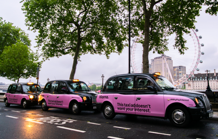
Klarna’s latest activity—their #WhyPayNow campaign—was a copy-led brand awareness initiative that used hard-hitting facts to underpin their interest free message. Edited down to a sentence per side and carefully set within the taxi space, the final executions were clear, concise and memorable.
Marketing Manager Mark Godfrey agrees, “Our campaign was copy heavy and we relied on Ubiquitous to ensure our message had maximum impact and clarity, utilising their knowledge and expertise of the medium.” What does this mean? Well, for us here at Ubiquitous, this means ensuring the client’s message sits in the optimum position on the taxi; utilising the space to ensure not a word is missed, whether in motion or at a standstill.
Taxi advertising is typically a medium on which people shy away from copy-led creative. When, in actuality, the old ‘work smarter not harder’ adage applies; make your copy work for your medium, not the other way around.
Another challenge that brands face is working with pre-existing assets, not necessarily created with taxi advertising in mind. Taxis are often booked as part of an integrated campaign, so it’s not unusual for assets to have been finalised for more straightforward OOH specs such as billboards or 6 sheets, that benefit from a standard horizontal or vertical format. The challenge, then, comes in adapting those.
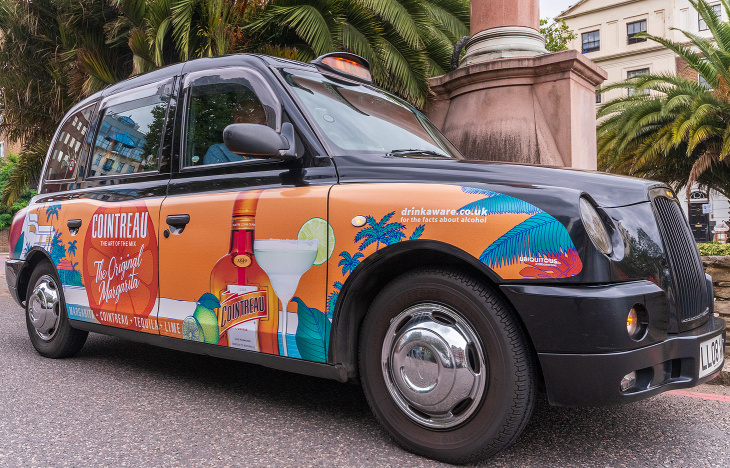
Most recently, Cointreau enlisted our help to re-edit existing creative to best fit the SuperSide format. Taxis were included as part of a wider execution that included OOH, VOD, digital, and print; understandably, creative existed within the confines of those resolutions.
We took the rectangular composition and layered creative assets in such a way that the focal point remained, the hero orange tones and colourful illustrations promoting the Original Margarita were not lost, and the overall end result maintained a level of sophistication and brand (and campaign) integrity.
“I worked with Ubiquitous on the Summer 2021 taxi campaign for Cointreau,” says Cointreau Brand Manager Allison Renfrew. “They were incredibly quick and efficient… with very little direction on my part. I am delighted with the outcome and look forward to working with them again in future.”
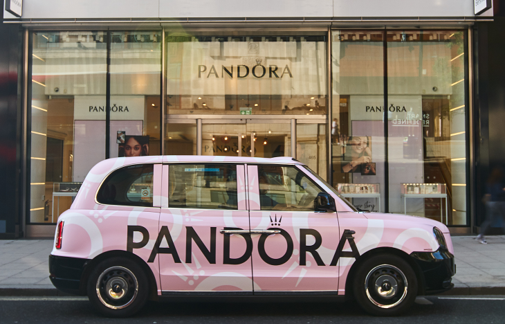
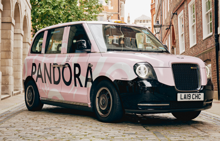
The easiest way for us to present these solutions to agencies and clients is via our FOC mock up service; a quick way for us to show you the potential of your campaign on both our SuperSide and Livery formats. Pandora, for example, were able to provide us with assets that included a logo, monogram, and colour story specs. The creative design of their Livery taxis was largely influenced by our acute understanding of what works best on these iconic vehicles.
Utilising our mock up service for guidance, we presented the team with a handful of options illustrating what we felt would look most effective for their summer PR activity. The result was a brand colour wrapped taxi that mimicked the creative found on their social channels—an, “Eye-catching and on-brand design,” commented Pandora Brand Marketing Manager Rosie Reeves.
“The team were really efficient and [the taxis] acted as the perfect PR moment, transporting brand ambassadors to and from our Pandora in the Park event in style.”
Though the challenges of taxi advertising may at first appear considerable, there are many effortless solutions – really, creative should be the last reason to shy away from taxis. But, in case you don’t know where to start, luckily, we do.


